Bir Olimpiyatın Görsel Alfabesi

1972 Münih Olimpiyatları için geliştirilen görsel sistem, uluslararası iletişimde yeni bir yaklaşımın örneğiydi.
Alman tasarımcı Otl Aicher tarafından hazırlanan bu sistem, spor dallarını temsil eden piktogramlar üzerinden şekillendi. Her bir simge, sade geometrik formlar ve belirli bir ızgara düzeni içinde oluşturularak görsel bütünlük sağlandı. Karmaşık açıklamalara gerek kalmadan bilgi aktarımını mümkün kılan bu semboller, farklı kültürlerden kullanıcıların anlaması için evrensel tasarlandı.
Aicher, siyah ve kırmızı gibi otoriter çağrışımlar yapabilecek renklerden kaçınarak pastel tonları tercih etti. Bu tercihler, organizasyonun genel atmosferiyle tutarlı bir görsel dil oluşturdu. Olimpiyatlar dışında da kullanılmaya başlanan bu sistem, kamusal alanlardaki yönlendirme grafiklerinin temelini oluşturdu. Havaalanları, otobüs durakları ve şehir haritalarında kullanılan birçok sembol, bu yaklaşımdan doğrudan etkilendi. Tasarımın işlevsellik, erişilebilirlik ve görsel tutarlılık ekseninde geliştirilmesi, piktogramları uzun vadede kalıcı ve uygulanabilir hâle getirdi.
----
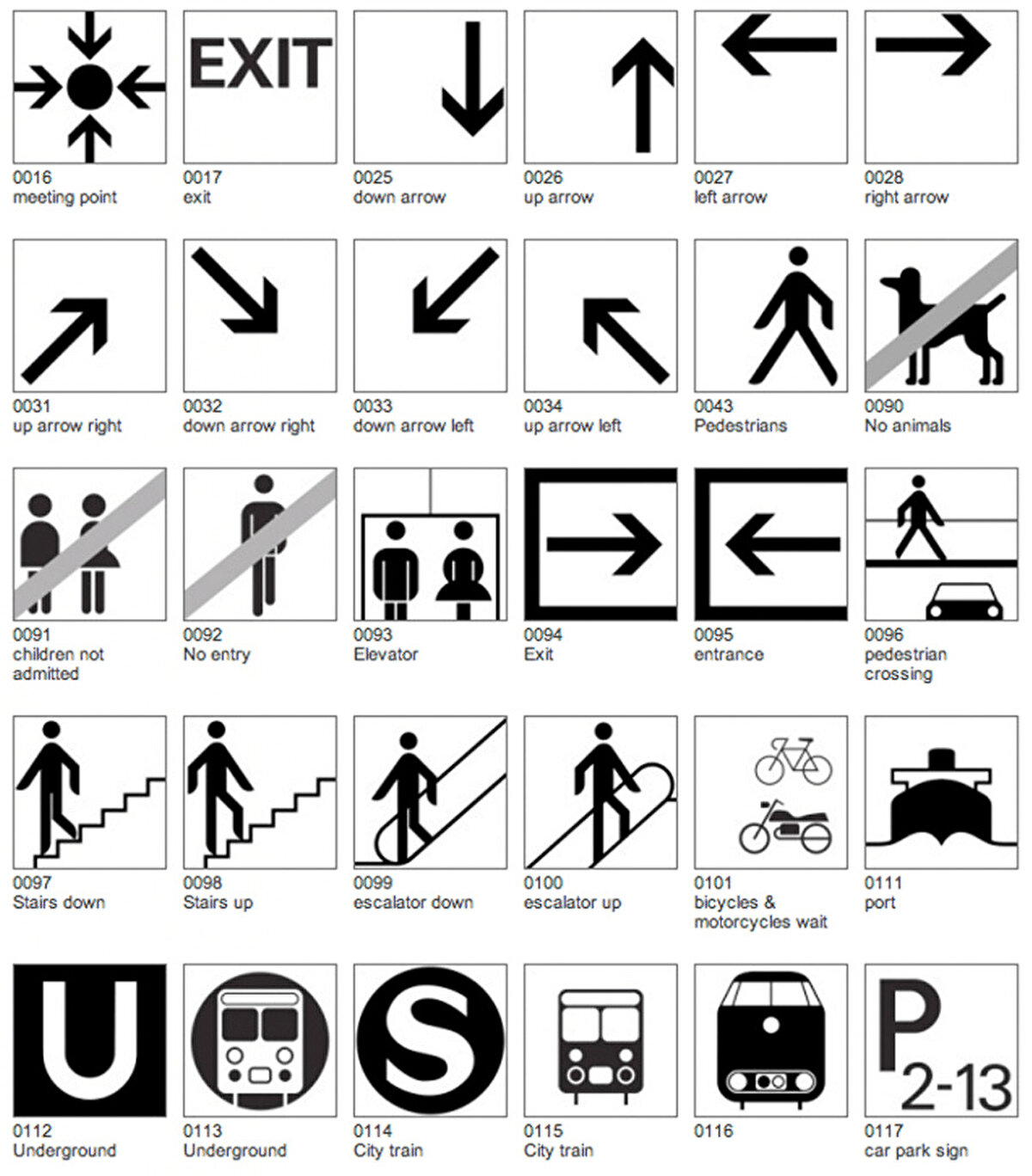
The visual system developed for the 1972 Munich Olympics was an example of a new approach to international communication.
Created by German designer Otl Aicher, this system was shaped by pictograms representing sports branches. Each icon was created with simple geometric forms and a specific grid layout to ensure visual integrity. These symbols, which make it possible to convey information without the need for complex explanations, are designed to be universal so that users from different cultures can understand them.
Aicher avoided colors with authoritarian connotations such as black and red, preferring pastel tones. These choices created a visual language consistent with the overall atmosphere of the organization. This system, which was also used outside the Olympics, formed the basis of the directional graphics in public spaces. Many symbols used at airports, bus stops and city maps were directly influenced by this approach. Developing the design around functionality, accessibility and visual consistency made pictograms permanent and viable in the long term.
1-3

2-3

3-3